Seven strategies to ensure your algorithm passes the UI test
Make your algorithm useful to your users, and provide intuitive ways to support their actions and decisions

You’ve created a great algorithm to fuel the AI of your software program. To distinguish yourself from the many accomplished data scientists of today, take one more step: Make sure your teams and customers can find, understand, and take action on the algorithm’s output.
To make your algorithm useful, focus on how it interacts with users so that the UI provides intuitive ways to support their decisions and actions. Based on our experience, we recommend that you manage the algorithm’s complexity and the usability, explainability, and actionability of the results you display.
Tame today’s technical complexity.
To understand the importance of building a useful algorithm, step back and consider the technology landscape your users are dealing with.
The B2B marketing technology landscape has grown over 5000% in the past decade. Just take one look at the Marketing Technology Landscape infographic (from chiefmartec.com) for a visual perspective. In 2011, there were roughly 150 tech solutions, and by 2020 there were 8000. What’s more, B2B marketing teams use an average of 21 technologies to conduct their day-to-day business.
The numerous technologies and siloed data within each technology can easily overwhelm the marketers who evaluate them. Besides, B2B buyers’ interactions with brands are omnichannel and multi-device. Seventy-five percent of technology buyers use more than three channels during product research, which can involve as many as 36 touchpoints, six contacts, and numerous types of account data spread across them, including:
- Firmographics (country, industry, revenue, number of employees, social media presence)
- Technographics (technologies prospects use)
- Intent (content prospects consume on the internet)
- Marketing and Sales activities (campaign responses, email opens, meetings)
- First-party data (directly from your website)
- Third-party data (from a third-party provider)
The seven strategies for creating a useful algorithm
At Demandbase, as we learned to tame the complexity of our customers’ data, we discovered several challenges and came up with solutions. We suggest them here as a way to guide your users through the derived data that your algorithm uncovers.
1. Instill a respect for design in your team.
Your algorithm is only as good as the use cases it satisfies for your customers. Guide your team with these questions and considerations:
- Does the overall flow make sense?
- Is your algorithm as clear as it needs to be—but no more complex than it needs to be— so that it allows for future extensibility?
- How will the flow of your algorithm fit into the user workflow?
- How will each result of your algorithm surface in the product?
- Have your data scientists been exposed to the creative side of visualization?
Ask them to imagine the user experience and how they interact with the algorithm’s outcome in each screen. Better yet, ask them to draw out the storyboard, screen-by-screen. Are the interactions consistent and coherent? Can they meet the UI designers half-way and help them understand the value of what to expose? - What are some creative ways to visualize complex data?
Complex data don’t have to be exposed all at once. It may take a series of visualizations to expose information to users gradually. Import a realistic .csv file, and run your algorithm in demo mode, so you can get as close to understanding the user experience as possible.
2. Name the algorithm output in a way that guides the user experience.
At Demandbase, we gave intuitive names to the algorithm outputs so that customers can readily understand the value of the output. For example, in the latest version of our software, Demandbase One, we settled on two important indicators to reveal the value of the available data: Qualification and Pipeline Predict Scores.
Qualification Score
The Qualification Score is aptly named because it solely qualifies the likelihood of an account ever becoming a customer.
The criteria are pretty simple, including firmographic and technographic data, and we only run it once by default. The name indicates clearly that these accounts meet the basic requirements to qualify for your attention.
The return for such simple criteria is relatively large, so we offer our users an out-of-the-box report, Top Qualification Score Accounts. This report is the first step towards surfacing prospects from the customer funnel that best match their Ideal Customer Profile (ICP) and are worthy of their time and investment.
Pipeline Predict Score
The Pipeline Predict Score indicates how likely an account is to become an opportunity within the next 30 days compared to existing opportunities. The criteria include past CRM opportunities, customer activities, historical and trending intent data, known and unknown website visits, and advertising activity.
These criteria are more robust than the Qualification Score, and we run this algorithm for every Demandbase One CRM account every night. There is also an out-of-the-box report, Top Pipeline Predict Accounts with No Sales Follow-up, which helps our Sales reps know which accounts need their attention the most.
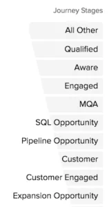
Journey Stages
 Qualification and Pipeline Predict scores answer a lot of questions, but to decide when to do what, Sales needs to understand these scores in the context of the buyer’s journey. So that’s where Journey Stages comes in.
Journey Stages maps where an account is in its lifecycle to help Marketing and Sales understand when and how to interact with a prospect.
With Journey Stages, we’re increasing the level of actionable insight for Sales to move their accounts forward. Depending on the account’s Journey Stage, Sales might add the account to an advertising campaign, to a Salesforce campaign, or to direct outreach.
As they get more familiar with Journey Stages, Sales can even customize the names and stage definitions.
Incremental Learning
Each tool’s clear names plainly explain its function, guiding the user from the simple to the complex. Additionally, the increased specificity from the Pipeline Predict Score to the Qualification Score and then to Journey Stages is significant. As customers go from one score to the next, we guide them towards a deeper understanding of the data, adding a greater degree of actionable insight at each stage.
By the time the user gets to Journey Stages, they are ready to act on them. We could have exposed Journey Stages alone, adequately leading Sales teams towards success with actionable information. However, by starting our users off with the Qualification and Pipeline Predict scores, we gradually add not only actionability but also usability and explainability.
3. Offer information that is convenient for CUSTOMERS.
Data scientists are most comfortable working with quantifiable data, such as data at the interval or ratio level. However, our customers have a lot of subjective domain knowledge that helps them make useful judgments, but this knowledge is qualitative rather than quantitative. How do you bridge the gap?
Our Engagement Points feature is an example of how we translated subjective customer data to relative scores for our customers and quantitative data for data scientists.
Engagement Points are a nifty little tool that we provide our customers to assign value to engagement activities, such as page visits, downloading a white paper, or using the Contact Us form. The points are a value relative to meeting minutes. For example, attending a 30-minute meeting would count as 30 Engagement Points, and, relative to that, a customer might count asking about a webinar as 1 “minute,” signing up for it as 4, and a CEO attending a meeting a little higher, say 37. Engagement Points represent how important an activity is compared to other activities, putting their value in perspective.
Engagement Points are at the ordinal level, allowing the user only to identify if one value is higher than another. Activities can be ordered from first to last, but when you try to include them in an algorithm’s math, they aren’t reliable.
To make Engagement Points useful, we enabled our algorithm to determine the weight of each engagement “point,” thereby customizing the meaning for each customer.
In this way, Engagement Points can remain subjective for the user while closely approximating the value they intended, so they work in mathematical calculations. For example, our algorithm would notice that, for one customer, a CEO attending a meeting had twice as much value as a Director attending the same type of meeting. But for another customer, the value of a CEO’s attendance may only be 1.5 times more valuable than a Director’s.
Overall, we found it worth the effort not to shy away from complicated issues but are useful for the user when they are addressed.
4. Create clear expectations for corner cases.
We found that it wasn’t easy to make our algorithm work for every customer all the time. There were corner cases that very rarely happened but were problematic when they did. We tried to soften the blow of weird corner cases but found that the most common problem was that the customer didn’t have enough data or not enough quality data. Not enough data is not fixable. Without enough data, you have fiction, not prediction. Enough quality data is a prerequisite for successful outcomes.
In the case of lack of data, the remedy we decided on was to add a warning to the UI telling our users that the model can’t train if they have less than 50 opportunities. We recently realized that we should emphasize that opportunities must be quality opportunities–that they must have activities associated with them. Activities lead to opportunities, so if we don’t have any activities leading to them, we can’t be sure they’re legitimate opportunities.
If a customer is experiencing this problem, we ask them to provide more quality data. In this way, we manage reasonable customer expectations and maintain confidence in the product.
5. Make your results human-verifiable.
Point out what to expect to ensure that the model worked as anticipated and that the results are correct. Even better, if you can give a warning, such as “This model is not performing as expected because of lack of quality data. Provide at least 50 opportunities with activities.”
To build confidence and trust in our models, we added the Account Explainer to present the top factors, typically activities, and how much these factors contributed to the Qualification Score and Pipeline Predict Score for each account. As a result, when customers see “Manager opened email” as one of the top factors in the UI, they can go to the activities screen and validate that such activities indeed happened.
We used the SHAP library to build the Account Explainer. The SHAP library uses a game theory approach to explain the output of any machine learning model.
6. Document, document, document.
Data scientists often don’t want to document because they tend to feel it’s a point of honor to create an intuitive user experience. We understand that you make every effort to make your UI self-apparent, but in practice, we find that others who are new to our work need some help finding their way around.
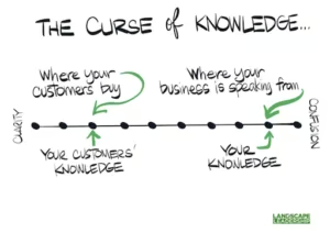
As data scientists, we should be cautious not to fall into the Curse of Knowledge bias: a cognitive bias that occurs when an individual communicating with other individuals unknowingly assumes that the others have the background to understand. Thanks to LandscapeLeadership.com for this visualization.
Here are some tips to guide the user to the best data insights:
- Explain the intended purpose of the feature and its benefits.
- Describe the kind of use cases it’s best suited for, as well as some corner cases that your feature is not good for.
- Explain what configurations are available, how to set them, and what results to expect from each customization.
- Give some guidance for what to look for in the results and how to act on them.
Keep in mind that documentation is part of the UI, the user interface. Your users face your documentation directly, so it’s part of their experience of your product.
7. Test, test, test.
During an end-to-end pipeline experience, a lot can go wrong. Data may be ingested, synced, and refreshed while your algorithm is running, so you can experience some hits and misses with the results. We allowed plenty of time to test data schema and data sync behavior. We also added a warning to wait when there is a data sync in progress. If you can tell users the status of the machine learning job and when to expect results, even better.
Summary
You may have an excellent algorithm, but it won’t help your users if it doesn’t fit, step-by-step into a meaningful UI. For any AI application with a user interface, use these strategies to organize your algorithm so that it syncs with consumable UI visualizations. The extra effort will help your users appreciate your effective data application and distinguish it from random guesses.
Related content


We have updated our Privacy Notice. Please click here for details.